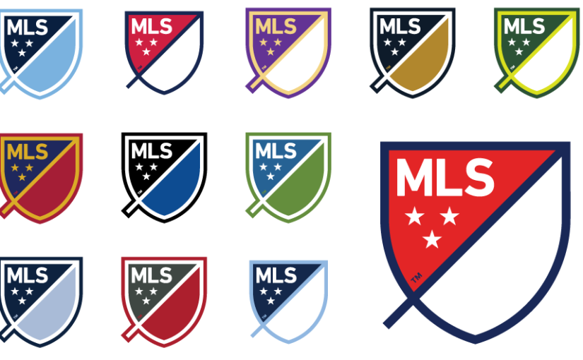
September 22 – The MLS has unveiled a new logo ahead of its twentieth season, to go along with its rebranding and rejuvenated aspirations to become a leading league in world soccer. Discarding the old boot and ball in black and white, the league has gone for the classic crest template normally seen as club logos.
Simple as it is, thoughtful symbolism lies behind the pattern. Here is the MLS’ description and reasoning, as posted on their website, for the design:
“Wordmark: MLS stands for Major League Soccer.
Slash: The slash refers to soccer’s speed and energy. The slash begins outside the perimeter and drives upward at a 45-degree angle to illustrate both the nonstop nature of our game and the rising trajectory of our league. It bisects the crest to create a “first half” and “second half.”
Stars: The three stars represent the pillars of our brand: For Club, For Country, For Community.
Perimeter: The perimeter represents the lines that mark off the field of play.
First and second half: The first half contains MLS and the three stars. The second half is an open white space that brings you in and out of the MLS world.”
The website also demonstrates how the colors of the crest can be changed to fit the colors of each MLS club. The crest will be on each team’s kit, and so they are adequately empowered to manipulate the scheme to fit their aesthetics. Furthermore, ample space is left for potential sponsors to nestle in beside.
By removing the explicit soccer reference from within the logo, the league is hoping to emulate logos like Apple and Nike’s, where the brand recognition is strong enough that the reminder as to what the logo represents becomes unnecessary.
As Howard Handler, MLS Chief Marketing Officer explains: “The more modern brands of the world don’t need to telegraph a specific category or line of business they’re in. In many cases, they stand for something much bigger.” Furthermore, the website states, “Our new brand will build meaning over time so that our new crest signifies soccer in North America and has a unique place in global sports”.
This is to move in a different direction than all of the big five European leagues though, who all contain at least some semblance of a kickable spherical object in their logos – be it a lion standing on a ball for the Barclays Premier League, or the more oval looking object in the Serie A’s artwork.
The MLS are looking to stand out, hoping their crest “will visually represent the type of business we are…The shape of the new MLS brand takes inspiration from soccer crests, which are a traditional part of the game across the world. This enables us to point to soccer while also differentiating and redefining how a modern sports league is viewed.”
Handler sees the new crest as an emblem of the MLS’ progress, ambitiously stating, “We have etched a new milestone in our future today – a culmination of the many monumental changes that have positioned us for rapid growth. In the last 18 months, we have introduced new teams, new soccer-specific stadiums, an eight year, multi-million dollar media rights partnership, and our owners have made significant investments to sign world-class athletes. Together, these elements have led to the realisation that our current brand is no longer a proper representation of the league we are and want to become.”
Don Garber added his voice to the congratulatory comments too, stating, “Today is about a new vision for our future. That future we call ‘MLS Next,’ a reminder that our best days are ahead. It’s a reminder that tomorrow is going to be great, but the day after tomorrow and the day after that will be better for us.”
The masterminds behind the logo were in-house persons working with agencies Gigunda, Athletics and Berliner Benson. The logo will come into operating effect starting in 2015.
Contact the writer of this story at moc.l1743707247labto1743707247ofdlr1743707247owedi1743707247sni@n1743707247osloh1743707247cin.n1743707247eb1743707247

