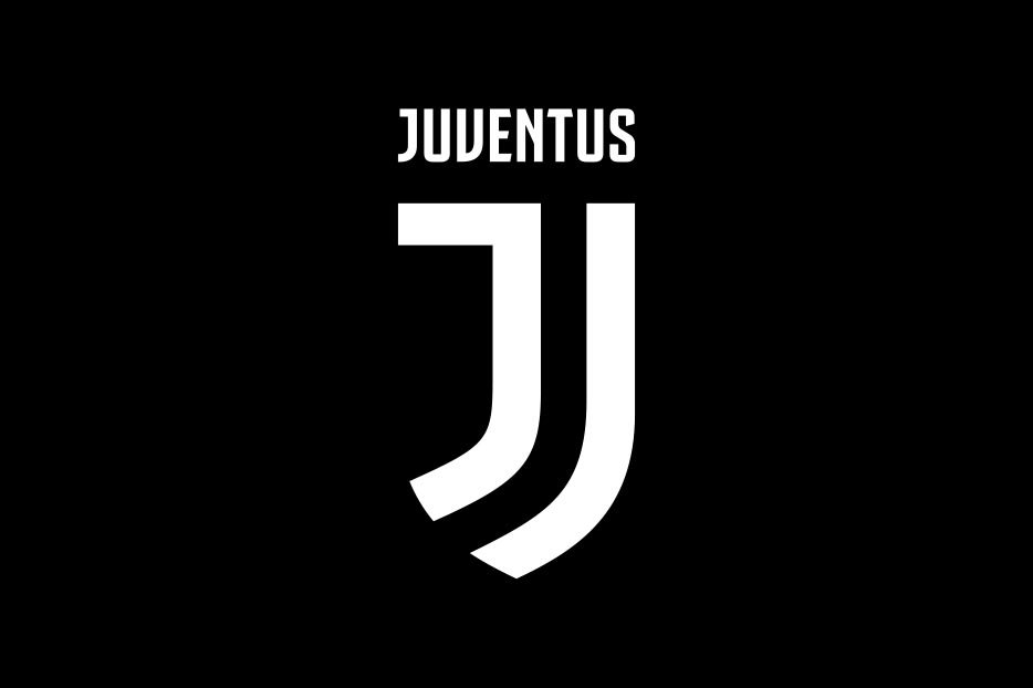
January 18 – Italian giants Juventus have taken a huge branding step with the unveiling of a radical new logo and a club ‘philosophy’ based around expanding the club’s fanbase, commercial opportunities and deepening fans’ emotional involvement with the club.
Taglined ‘Black and White and More’ the new stripped back logo and visual identity for the club is more than just a tweaking of the club’s crest. It is a complete overhaul of the brand values in terms of design and positioning more akin to high street fashion brand relaunch than the more traditional world of football branding.
On the club’s website it boldly claims it is “changing the rules of the game and expanding the limits of their universe”. The new design is a move to boost commercial revenue and attract new fans.
“Juventus’ objective is to grow in terms of presence and influence and to expand the business side of the club through a series of radically innovative initiatives, targeting both Bianconeri fans all over the world and those with less of an interest in football,” said the club.
The simple design may be minimalist but it does have a high fashion feel, whether you are a traditionalist who believes club logos should never be changed or not.
Gianni Agnelli once said: “I get excited every time I see a word beginning with J in the papers.” It is that sentiment that the new logo is looking to capture.
Launched at the Museo Nazionale della Scienza e della Tecnologia Leonardo Da Vinci in Milan at an event that was streamed live on www.juventus.com/en and JTV, the new logo will be applied across all the club’s (the website eschews club for ‘brand’) physical and digital media from July 2017.
“No club in Europe has so far been able to transcend sport and convey the philosophy behind that,” said Manfredi Ricca, Chief Strategy Officer for EMEA & LatAm at Interbrand, the agency that carried out the redesign. “If there is one club capable of taking that step, it’s Juventus – the brand is synonymous with ambition and excellence and these are principles that can inspire truly unique experiences. The new visual identity has been designed to boldly take the club’s spirit into new, unexpected realms.”
Initial reaction on social media was understandably critical of this radical departure though it was pointed out that this was the third redesign of the logo in the past 30 years. Though this redesign is certainly a game-changer.
One twitter comment, meant sarcastically, was that the new identity looked “like the kind of thing Pogba might have shaved into his head”. I think that might be the point.
Contact the writer of this story at moc.l1745261766labto1745261766ofdlr1745261766owedi1745261766sni@n1745261766osloh1745261766cin.l1745261766uap1745261766

