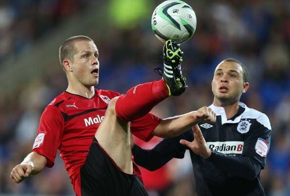
Now that I’ve seen the pictures, I am ready to believe it: Cardiff City are playing this season in red shirts (Heiðar Helguson, pictured below left, in the new shirt).
It feels wrong – like archery at Lord’s or Usain Bolt doing the polevault.
My personal image of Cardiff will always be caught up with Jimmy Scoular’s team that so nearly made it into the top tier of “English” football in 1970-71.
That was the team of Gary Bell and Don Murray and, for a few inspired months, of Liverpool-bound John Toshack, one of the original “big men with a silky touch”.
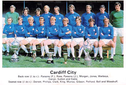
They played in simple, bright blue shirts (1967 team pictured second image down).
They were called the Bluebirds.

Tradition, though, is a funny thing in football.
Given the ease of travel, the ubiquity of larger-than-life images of global megastars such as Fernando Torres and Lionel Messi that can be piped straight to your living room, it seems faintly miraculous that anyone would still bother supporting, I don’t know, Stalybridge Celtic or Stockport County.
But they do, in some cases more fervently than ever.
And given the surreal casino-cum-bazaar that top-level football has become, it seems astonishing, at first glance, how rare kit changes such as Cardiff’s have been in the silly money era of the past two decades or so.
Away strips, after all, were handed over long ago to the tender mercies of marketing teams tasked with maximising revenues.
And monstrosities without number have been foisted on faithful fans up and down the country as a result.
But, while home shirts, of course, change almost as regularly, clubs big and small have stuck religiously with the basic colour schemes that their players have worn onto the pitch, in many cases, for more than a century.
If I didn’t know better, I would be touched.

While it would be nice to think though that this phenomenon is explained by a reverential regard for the history of football clubs, my strong suspicion – at elite level at least, where clubs these days aspire to a global fan base – is that it has far more to do with effective branding.
Think about it: in the corporate world, where many multinationals have taken the trouble to cultivate an association with a particular colour or colours, how frequently do they change these self-ordained liveries?
Almost never, I would say.
For how many decades has Coca-Cola’s corporate colour been primarily red? Or McDonald’s red and gold?
Or take banks: I can’t remember a time when Lloyds was not green and Barclays blue.
In France, BNP is the green bank, with Société Générale’s colours red and black, and Crédit Lyonnais’s yellow and blue.
In Canada, Toronto Dominion’s domain is green, Bank of Montreal’s blue and Scotiabank’s red.

One of the rare football kit changes I can call to mind – Liverpool’s switch from white shorts to red (pictured above, left) in the mid-1960s – had the effect of reinforcing the link between the club and a particular colour, rather than weakening it.
In that case, it also helped to differentiate Bill Shankly’s rising force in the game from Manchester United (1950s kit pictured above, right), Liverpool’s most intense local rivals along with the blues of Everton.
It is one of the saving graces of the cut-throat business that professional football has become in Britain and elsewhere that fans still hold the traditions and history of their clubs as sacrosanct.
But fans also crave success.
It is my strong hunch that if their club wins promotion to the Premier League this season, the majority of Cardiff supporters will conclude that the abrupt and startling change to the colour of the official club shirt was an acceptable price to pay.
Beyond the insular, cartoon-strip world of British football, after all, a different-coloured shirt is an infinitesimally tiny cross to bear in the grand scheme of things.
Think what east European fans have had to contend with in their footballing – and, more particularly, non-footballing – lives over the past few decades.
Górnik Zabrze and Ujpesti Dózsa each contested a European final against English opposition at around the time Scoular’s Bluebirds were flying high.

Yet I don’t suppose many west European fans today could even identify what countries they are based in.
If you still doubt my assessment of Cardiff’s switch from blue to red, consider the example of the one top English club I can think of that has undertaken a fundamental colour change in the past 50 or so years.
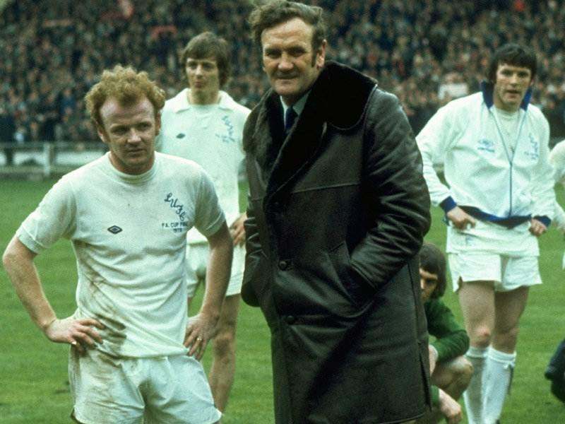
Leeds United was in a sorry state when one Don Revie (pictured above, centre) decided to change the club colours from blue and yellow to all white.
I am not sure if there is a causal link, but the change eventually ushered in the most successful years in the club’s history.
How many people who are not Leeds fans now even know that the club’s home strip has not always been white shirts, white shorts and white socks?
Put another way: try picturing Billy Bremner (pictured above, left) in a blue and yellow kit.
So I feel on reasonably solid ground in predicting that history’s verdict on Cardiff City’s red shirts will hinge largely on results on the pitch.
Fall short in the always frenetic Championship promotion race and it may one day come to be seen as an embarrassing aberration; make it to the Premier League and it will be anything but.
David Owen worked for 20 years for the Financial Times in the United States, Canada, France and the UK. He ended his FT career as sports editor after the 2006 World Cup and is now freelancing, including covering the 2008 Beijing Olympics and 2010 World Cup. Owen’s Twitter feed can be accessed here.

