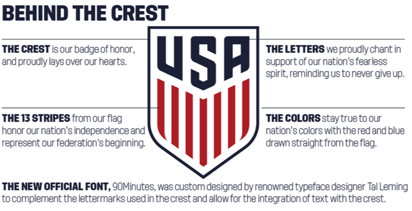
March 2 – The United States Soccer Federation (USSF) has unveiled a new crest, which it says respects the past and represents the future. USSF revealed the crest by sending packages to its Members and encouraging them to share the news and merchandise on social media platforms.
The rebranding was a concerted effort that began in 2014. $1 million was spent developing the new look with Nike.
The ball and stars from the crest that has been used since 1995 have been ditched in favour of a minimalistic style. The intended symbolism in removing the ball is that the crest can represent the sport and country both on and off the pitch.
Stars, from now on, will only appear above the crest upon World Cup victories. This means that the US Women’s team will have three stars: representing the 1991, 1999, and 2015 World Cup victories. For now, the US Men’s team will be starless.
Heritage has not been forgotten, though, since the crest was designed to evoke the imagery of USSF’s original 1913 crest, albeit in “more modern, aggressive and patriotic” form.
USSF sent 10,000 packages, adorned with the writing “One Nation. One Team”, to its members that included a scarf with the new crest. The package also contained a video of the US Men’s and Women’s national team, narrated by current and former stars.
The impact of bypassing the formal media press release route, in an attempt to directly connect with fans, was blunted by the leaking of the crest around seven months ago online.
In furtherance of the rebranding process, the US Men’s team revealed that they have a new black away jersey. The shirts have drawn some attention, and criticism, from fans who are displeased to have the predominant colour be black because, somewhat like Oscar nominees, it is not the tradition of the USA.
Contact the writer of this story at moc.l1734874733labto1734874733ofdlr1734874733owedi1734874733sni@n1734874733osloh1734874733cin.n1734874733eb1734874733

